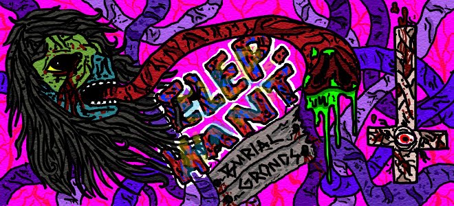
This was the very first step just very rough lines done in photoshop to get the idea for the ad down.
This is my color comp got all my ideas down fast and was ready to start on the final.
and this is the final all done in photoshop and I used photo reference for the unicorn because I suck at drawing magical horses. You may wonder how I had photo reference for a fictional animal .... all I can say is I may have the only proof that unicorns are real.
hope you like the ad and thanks for checking it out.


This is really good Colton! Very funny. XD
ReplyDeletehaha, this is awesome! great work!
ReplyDeletethank you kindly
ReplyDeleteColton; as we discussed in class, I think you have a very strong concept here. Its engaging, amusing, and the execution is really appealing. It reminds me of Grand Theft Auto or something... a nice, effective tie-in for the demographic you were targeting. Great work! :^)
ReplyDelete